|
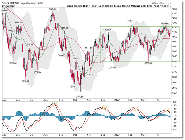
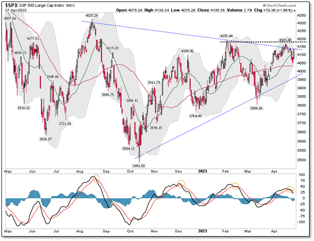
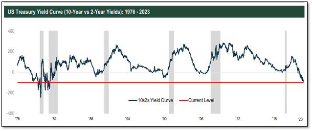
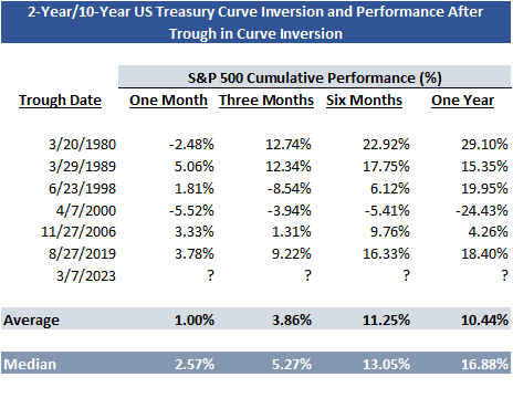
Are you old enough to remember a song by Stealers Wheels called Stuck in the Middle with You from 1972. Click on the link to see if you remember this hit from the 1970s. The You in this case is Mr. Market or to be more relevant to our culture today, them/they Market. The Stuck is the S&P 500 Index and we have been stuck in a range (“the middle”) since the end of 2022 (green box, below). Right now, we are at the top of the range. We believe we are moving towards the middle or lower end of the range over the next few months Why do we believe we will move to the middle or lower end of this range? Simply, the MACD moving averages are crossing over to the downside (see orange circles in lower chart pane). When this happens, it has historically led to a market decline or pullback. If I bring back that same chart, remove the green box and add a large consolidation triangle (blue dotted lines), you will see that something needs to break in the short-term. We either move higher and break above the dotted black line and the February highs or we head to the lower end of the triangle or potentially the lower end of the green box from the first chart. Once again, the lower chart window indicator is telling us the odds favor moving lower as the markets are very overbought. Seasonally, we are also entering the “Sell in May and Go Away” months of summer where positive returns have historically been harder to achieve. Thus, the seasonality seems to line up with what we are seeing in the charts. Let us now try to add a bit of bullishness to this discussion. In our client’s Q1 letter, we discussed the spread between 2-year and 10-year US Treasury yields and the fact it had declined below zero (called a Yield Curve Inversion). This inversion is a very dependable signal that a recession is coming in the next twelve to twenty-four months. Historically, after the inversion troughs and starts to reverse, we generally see positive market returns. Why is this? We are not in recession yet and 2-year rates begin to drift lower which allows short-term borrowers to lower their interest costs and thus this spurs some economic growth in the short term. As you can see (below), the 2-year/10-year US Treasury yields are currently inverted (below the gray zero line) but have recently started to reverse upward (not yet visible on the chart below). Historically, if you measure from this possible trough (i.e., reversal point) in past market cycles, we have realized a period of positive market returns of 10% - 11% over the ensuing six-to-twelve-month periods, on average (or a median return of 13% - 17% over the same period). So how does this fit into our current situation?
First, we are at a potential 10s2s yield curve trough and you can see historically that has meant positive returns over the ensuing 12 months. Second, I believe we will unfortunately remain range bound in the green box from chart one. However, there is a good chance we revisit the lower end of that green range box and then finish the year at the upper end of that box again. Thus, if we can minimize the effects of the decline and capture most of the increase, we see a chance to finish 2023 on a winning note. Finally, we believe the pace of Federal Reserve interest rate increases is slowing and such increases are nearing a pause. This has historically been a strong time for fixed income/bonds where we can lock in higher interest rates and potentially benefit from rising fixed income prices when the Federal Reserve lowers its Fed Fund rate to fight the coming recessionary weakness in late 2023. As you can see this is a trader’s market right now! The most challenging Macro environment that we have experienced in 26 years of doing this. If we can help you navigate it, please feel free to reach out to us. Disclosures: Past performance is not an indication of future performance and there can be no assurance that the strategy will achieve results in line with those presented in this performance summary. No representation, warranty, or undertaking, express or implied, is given as to the accuracy or completeness of the information contained in this material by any person; no reliance may be placed for any purpose on such information; and no liability is accepted by any person for the accuracy and completeness of any such information. The S&P 500 is a capitalization weighted index of the 500 leading companies from leading industries of the U.S. economy. It represents a broad cross section of the U.S. equity market, including stocks traded on the NYSE, Amex, and NASDAQ.
0 Comments
Your comment will be posted after it is approved.
Leave a Reply. |


