|
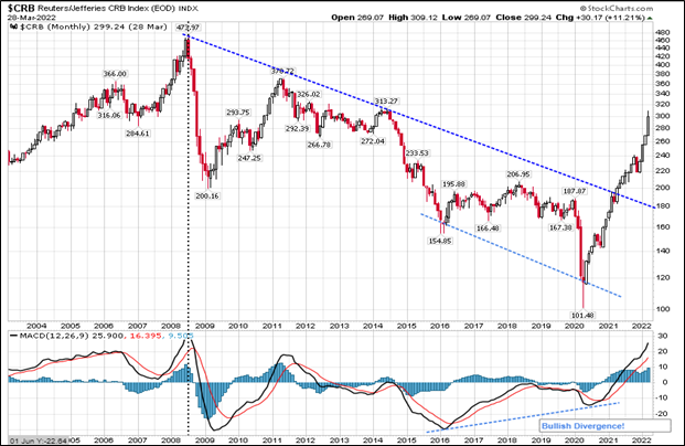
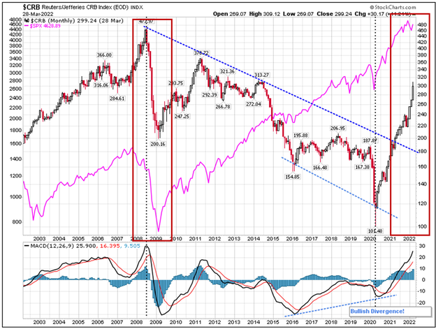
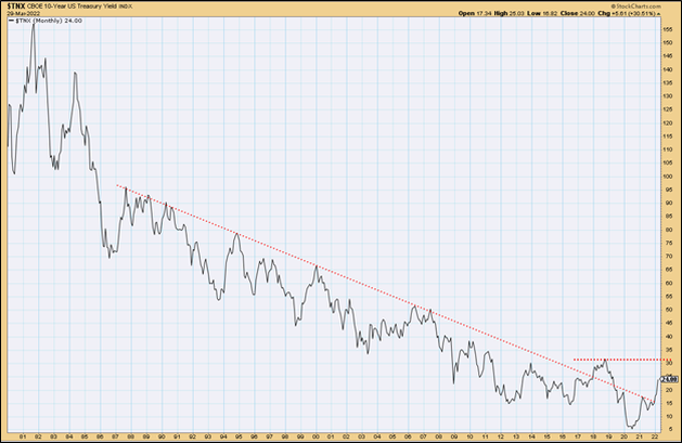
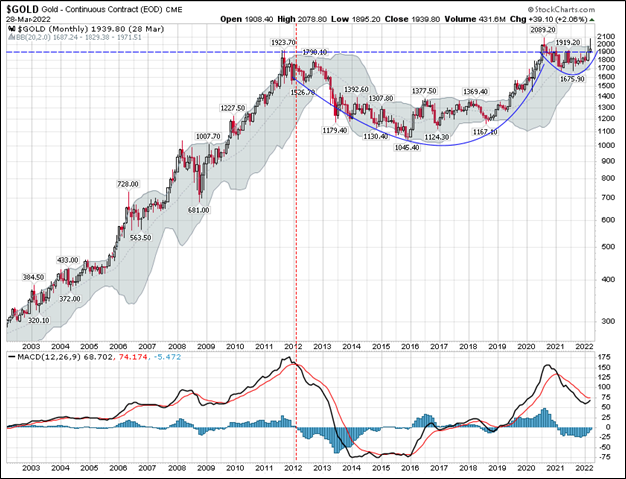
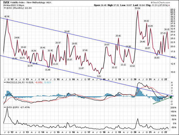
In last month’s blog post entitled A Season of Volatility and Constant Change, I focused on the crazy world we now live and the possibility of us being in the Fourth Turning, a time of crisis where institutional life is destroyed and then rebuilt. We discussed that the economy runs in cycles and that was important as investors to understand those cycles. Investors must also be willing to look beyond what has worked in the recent past and instead understand what should work in the cycle to come. Finally, we outlined various asset classes and how they performed during different cycles and suggested that several asset classes that may not have recently performed well, but did so historically over much longer time periods, such as gold or commodities. Today, let's take a look some recent charts and see if we can spot any changes in our market environment that might cause us to pause and reexamine our current investment allocations. Let’s start with Commodities: What you can see is that commodities (below) have been in a downtrend since the middle of 2008 and only in 2021 did they break out of that downtrend. At present, commodities are over-bought and will likely pull back and retrace some of the recent move, but the trend has changed. In other words, we have probably started another long cycle where commodities do well (i.e., a commodity super cycle). Here is something interesting, and I don’t have charts that go back further to test this over the past 100 years, however, look at when commodities last spiked and what happened to the S&P 500 index (pink line – below chart and red box). It went into a Bear Market decline. Our spike in commodity prices is even more extreme in 2021-2022 and the S&P 500 also could be just starting another decline. It is definitely worth watching this! Next up let’s look at interest rates, which move inversely with bond prices: Here is a chart of the ten-year treasury yield or interest rate, below. Notice that we have been in a declining rate environment since 1981 and only recently have we peaked above that long-term down trend in rates. This means that bonds have benefited from 40 years of declining rates, which have inversely pushed bond prices higher. We have yet to take out the prior lower highs at 3.25%, but I would guess that is where we are headed in the longer term. We may get another pull-back in rates as commodity related inflation recedes in the short-term, but higher rates appear to be in the cards eventually. Next let’s look at Gold As you can see above, gold rose through 2011 and then have been forming a cup from 2012 through 2020. Recently it has been forming a handle on the cup. This is a very powerful chart pattern and could portend that gold is about to go much higher in price. How many of you hold gold in your portfolios? I would guess that basing pattern since 2011 has pretty much soured all but the hard-core gold bugs on holding the yellow metal! That is how markets seem to work. When everyone is shaken out, then that asset price moves up and we are left to chase it higher. That is a very good-looking chart! So much so, I bought more gold today. Finally, let’s look at volatility. This is interesting! Volatility or the VIX is in the is a measure of the price movement in equities (in this case).
This chart is a bit busy, and I apologize, but the top pane of the chart shows the VIX or Volatility index. We have traded in a downward channel of lower volatility since Great Financial Crash of 2007-2008. However, since 2020 that volatility has spiked to a new level and held that level above 15. Also look at the MACD histogram in Blue in the middle chart pane, it is about to cross up through the zero line, which likely means higher volatility is in our future. Finally, the bottom pane is the correlation between equities and volatility. You will note that they are negative and inverse most of the time. This means that as volatility spikes, equities decline. Why do I show you all this? Certainly not to ruin your day! However, I do want to shake you to act! I firmly believe “we are not in Kansas anymore” in the words of Dorothy from the Wizard of Oz. You and your advisor cannot just do business as usual with your 60% equity and 40% bond portfolio. This next decade I do believe is going to challenge most investors. It is important that you be in the right asset classes and have the right approach to markets. I believe this unfortunately is a period where “actively traded”, beats “buy and hold.” It’s more work, it’s not as tax advantaged and it's more expensive, but it may be necessary to achieve your long-term objectives. This is what we do well. Let us know if we can help.
0 Comments
Your comment will be posted after it is approved.
Leave a Reply. |

