|
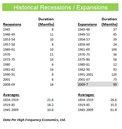
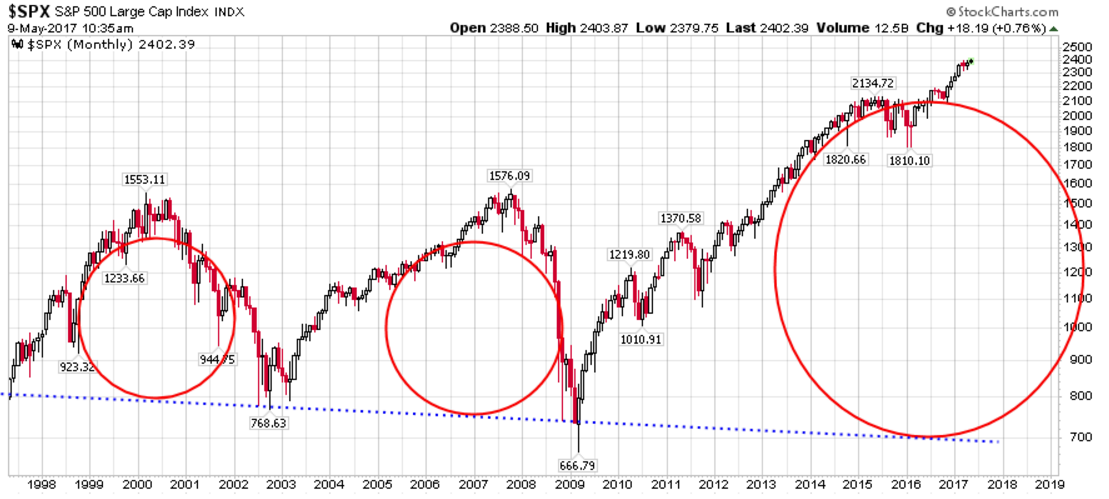
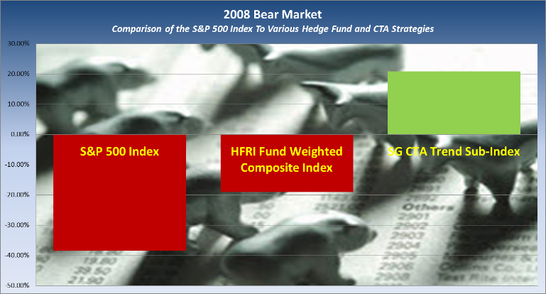
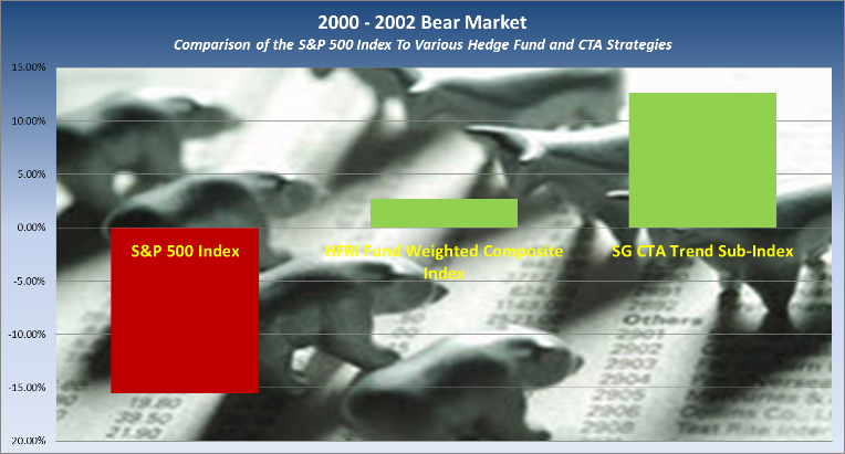
I think it is fair to say that this current economic cycle has surprised most, if not all, investment professionals. Of course, that is what trillions of dollars of Central Bank stimulus will do to a cycle! In this short piece, I would like to explore what are the odds of continued expansion, what might we expect as this market eventually tops, how deep the eventual bear market may go and where to invest when the air finally comes out of this expansion. What are the odds of continued economic expansion? I think the key phrase in this question is odds. As you can see from the table below, we are already in the second longest expansion in modern times. If you have ever been to Las Vegas, you would then know that this run could continue but with each passing month the odds start to stack against you further and the house odds continue to improve. In this case the house is the Mr. Market as we like to call him. How might this current bull market end? As we highlighted in our blog post entitled, Negative Naysayers Beware! (March 27, 2017), we believe the technical patterns are pointing towards a possible market move that could push prices higher into early 2018. That move could take markets up an average of 22.9% from the January 2017 trigger for this technical signal. We also pointed out that the bureau of labor statistics published a paper by Yale Professor William Goetzmann. In it, he showed that booms are rarely followed by busts. His study of 42 different stock markets from 1900 to 2014 found that booms are more likely to be followed by more booms. In fact, Professor Goetzmann found that a stock market that’s doubled in the past year is almost twice as likely to double again as it is to get cut in half in the year. The key question about this research becomes have we already seen our doubling. After all the S&P 500 index is now at roughly 2400 from a 2007-2008 low of 667? I would think again you must factor in one more idea and that is that markets and economies run in cycles. They cannot go up forever! If we do go up some 22.9%+ over the balance of 2017 this might be just the kind of move we typically see at the top of markets, where they sprint upward to a top and then fall under their own speculative weight. What does the cycle pattern look like? A cycle in economic terms is periods of expansion that are followed by periods of recession or contraction. Throughout the past 150 plus years there have many such cycles. The average expansion has lasted 26-61 months and the average recession 11-22 months. The markets tend to lead that same economic cycle by about 6 months. If we look at a 20-year chart of the S&P 500 we see these cycles clearly in the bull and bear markets. I realize this chart is a bit small but you can clearly see the cycles from 1997 – 2001, 2001 – 2009 and 2009 to now. We also took the liberty of adding two other features to this chart. The first is the red bubbles. If the current cycle were to end today, you can see from these bubbles that each cycle has gotten progressively larger. The second addition is the blue dotted trend line. This is where we believe markets could be drawn to when this current expansion ends and the bear market begins. If this trend line does represent the next market bottom, we would be looking at a possible 70% drop in the markets from current levels. Where does one invest while still profiting from the possible short-term market move upward? As I wrote about in our post entitled, Recency Bias and its Effect on Preserving Capital (January 23, 2017), we believe the one place you do not want to be is in a purely Buy and Hold (passive) strategy when this bubble bursts. Yet that is where most investors are rotating in search of returns today, while ignoring the greater threat that could come tomorrow and that is downside risk. In that post we demonstrated that the way to invest was to have both passive and active strategies in your portfolio to the manage risk, smooth returns and enhance long-term returns. It’s not one or the other, but both. However, if you were to invest new capital today in the markets you would have to worry that we are closer to the end of the cycle than the beginning. This would traditionally lead an experienced allocator to divvy up more of the pie to strategies that protect capital than purely try to maximize one’s upside. Let me show you what I mean. Let’s look at what performed well in the last two bear markets (2000-2002 and 2007-2008). Let’s start with the 2008 market decline. In this chart below note who made money while all other strategies lost money. The answer is the Trend Followers. They have the ability to profit on both rising and falling trends. Note, the average hedge fund lost money. Maybe not as much as the S&P 500 index (far left), but they still lost money. Let’s now look at 2000-2001. In this period the hedge funds did better (middle bar), but the trend followers still did the best. Funny, do you know who has done poorly during the last eight years of the current bull market. You guessed it! The Trend Followers. The moral of the story is easy when looking at recent performance of any strategy to let one’s greed cloud one’s judgment. I call this looking in the rear view mirror. It is therefore imperative to balance that greed with good old fashion common sense and a little dose of fear. Smart investors must be willing to be diversified and maybe give up some short-term gain to protect capital that then allows them to invest again another day. They must also know where they are in the economic cycle and anticipate where best to position their capital. Let me know your thoughts in the comments section below. Important Disclosures:
Past performance is not an indication of future performance and there can be no assurance that the above indexes will achieve results in line with historical results. This blog post is for informational purposes only and is not intended as an offer or solicitation with respect to the purchase or sale of any security. The S&P 500 Total Return is a capitalization weighted index of the 500 leading companies from leading industries of the U.S. economy. It represents a broad cross-section of the U.S. equity market, including stocks traded on the NYSE, Amex and NASDAQ. In this particular index dividends are reinvested and added to the index returns. The SG CTA Trend Sub-Index is designed to track the largest trend following CTAs and be representative of the trend followers in the managed futures space. The index is comprised of the 10 largest managers in terms of assets under management, equally weighted, rebalanced and reconstituted annually. These managers must be open to new investment and report daily returns. The HFRI Equity Hedge Index is an index of Investment Managers who maintain positions both long and short in primarily equity and equity derivative securities. A wide variety of investment processes can be employed to arrive at an investment decision, including both quantitative and fundamental techniques; strategies can be broadly diversified or narrowly focused on specific sectors and can range broadly in terms of levels of net exposure, leverage employed, holding period, concentrations of market capitalizations and valuation ranges of typical portfolios. EH managers would typically maintain at least 50% exposure to, and may in some cases be entirely invested in, equities, both long and short.
2 Comments
Your comment will be posted after it is approved.
Leave a Reply. |


