 I did a mid-month market update for clients (and select prospects) where I made the case that the rally we have seen in July and the first half of August was doomed to fail and was purely a “rip your face off” Bear Market rally. Unbelievably, the bulls kept pushing the markets higher trying to front run the Fed. They were not rewarded as the Fed’s focus remains on taming inflation. Fed Chair Powell put the markets in their place in a rather short and pithy, eight- minute speech from the Jackson Hole Summit. The markets tanked, thereafter, with the Dow Jones Industrial Average down more than 1,000 points on the day dispatching the bulls and sending them home licking their wounds. So where do we go from here and what is your best course of action? So far in 2022 the peak to trough decline through June was -24.5% for the S&P 500 Index. We have since gained about 60% of that back in July and August. As a next step, it would make sense to me that we should at least retest the June lows. It doesn’t mean we will, but that would be an absolute in my mind if I was pulling the levers of the markets. Historically, speaking a -24.5% Bear Market decline would be the smallest of the past 100 years of Bear Markets. It is possible, but given all the intervention, quantitative easing and zero bound interest rates of the past decade, is a decline of -24.5% really what you would expect? I personally am looking for at least the average decline of the past 100 years (or roughly -35%), if not much more. The market declines much faster than the time required to push it higher, but it is still a process. This means we will have bounces along the way lower in a Bear Market, like the July/August bounce. Over the past two Bear Markets, we had at least 7 bounces that retraced 50-70% of the prior decline. There will likely be many such bounces (both large and small) on the way to the ultimate market bottom. We also believe a retest of the recent June lows seems probable and then the market will likely spend some time testing that level. We believe we take out those lows, but that is just a guess at this point. One thing I am certain is that the markets will be more volatile and will ebb and flow in whatever direction the market is trending at the moment, which at this point is down. It is highly unlikely that we will just grind higher (or lower) like we have seen over the past decade when the Fed was providing the markets with ample liquidity. In fact, the Fed is removing liquidity from the markets which means they are more likely to grind lower than the higher. It will be very important in the decade to come to have a steady hand on the rudder of your investments to navigate through the coming storms including rising rates, inflation, supply chain constraints, the redevelopment of key manufacturing capabilities here at home, demographic changes and more that we just have just not seen over the past 75 years of U.S. protected global trade. So now that I side stepped, going too far with my market forecast, let’s discuss the actions you can take to assure you prosper now and, in the future, to come. First, you need the right advisor. One that excels at protecting and growing capital in tough markets and one that can assist you in planning for such contingencies so that you reach your financial goals. Of course, we are biased, but we believe we are such a shop. Second, cash is King. It has been unfashionable to hold cash over the past decade or more, but right now cash is your best bet as an asset class as we enter a recession here and abroad. Hold whatever makes you feel comfortable right now and sleep well at night! However, be prepared also to deploy it at the right time. Don’t be lulled to sleep holding cash for the long-term as it is still likely to earn you less than the rate of inflation, which means it is losing purchasing power. Third, the absolutes of the past decade are now gone. No one really knows when the markets will bottom or if it is really a bottom until some time has passed. Therefore, you need to resort to some tried and true methods to both deploy and protect your capital. I wrote a post in May 2022 on Dollar Cost Averaging in Tough Markets. This is one such method to manage risk while also not guessing at market bottoms. Get used to averaging into and out of markets in the years to come. They will be more uncertain! Third, you need to be more diversified. The days of the 60% equity and 40% bond portfolio are behind us. Care to guess the top performing sector for the year? You guessed it? Energy. 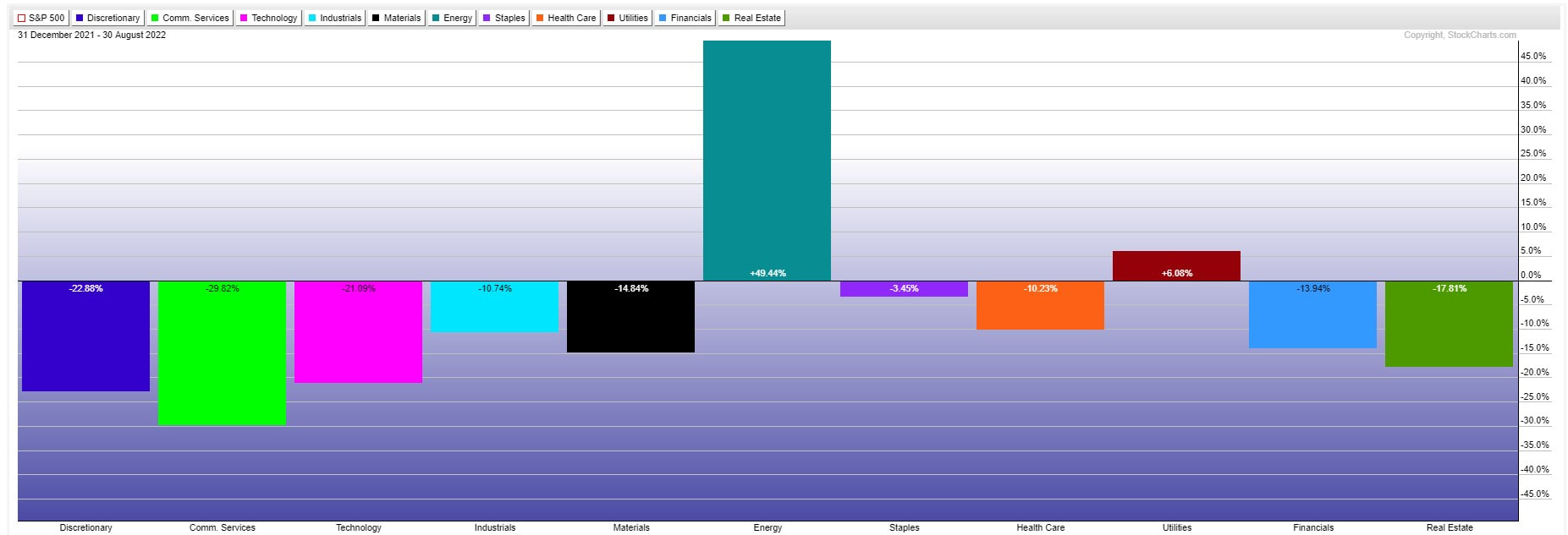 After years of underperformance, energy is now only 4.78% of the S&P 500 Index vs 28% of the S&P 500 in 1998. This means a passive equity fund plus bonds gives you only limited exposure to the top sector of 2022. With our clients, we have added alternatives allocations that include top sectors, commodities, currencies, metals, and liquidity trading managers. Bottom line, you need to diversify to broaden your exposure to both profit and protect capital in this kind of market.
Finally, seek out the cash flow generators. There is an old saying that a “Bird in hand is worth two in the bush.” That saying is very apropos today. We believe it is better to get paid cold hard cash than to wait on growth that may not materialize in the future. High dividend companies pay you today and they have more reasonable valuations vs. their growth stock peers. Guess what is the top paying dividend sector by percentage today? You guessed it energy. Let us know if we can help you today. Have a great Labor Day Weekend!
0 Comments
This has been quite the year for both equity and fixed income markets. Through June 30, 2022, the S&P 500 Index is down 21.25% and the Bloomberg Barclay’s U.S. Aggregate Bond Index is down -10.23%. There has been nowhere to hide, and portfolios have been tossed like a ship in a storm! June has been especially brutal with the S&P 500 Index sliding -8.38% over the past month through June 30, 2022.  Obviously, none of this is great news. This is especially true for those individuals who simply “buy and hold” through the storm! If there is a silver lining, it is that Bear Markets do not last all that long. According to John Hancock funds, the average Bear Market only lasts about 289 days (9.5 months) on average. The bad news is they hit investors with an average decline of -35.62%. If this current decline is average in any way, we are more than halfway home in terms of days as of the date of this post and about two-thirds the way in terms of percentage decline. Of course, when is the last time anything in your life was just average? Given all the problems in the world with supply chains, run-away inflation, high consumer, and sovereign debt levels and more, it would not surprise me if this decline was anything but average. There are two pieces of good news however that I want to share with you today. First, if you are a client of In Trust Advisors, you are down far less than the market averages mentioned at the top of this post. Second, the biggest gains come after the storm. Since you are likely not here to hear me brag about our relative returns, lets focus on the second point, “The biggest gains come after the storm.” First, I would suggest you read our post from last month called The Bigger They Are, The Longer the Recovery. It will help put into perspective exactly why it is so important to minimize losses and the importance of doing so within the context of average annual stock market returns. In a nutshell, if the average decline for the markets is indeed -35.62%, that means on average it takes a 55.33% gain in the markets to get back to breakeven. The average market gain in a Bull Market is roughly 10% a year or so based on the average; you are looking at 5.5 years to regain the loss. The kicker is the average bull market is just 3.8 years in length since 1932. In a typical market cycle, you would have reached the end of the cycle before you recovered your market losses from the prior Bear Market based on the averages. Most Americans have a relatively short memory, and it is easy to get blinded by the 11-year Bull Market we had from 2009 to 2020, which was the longest in history. Most bull markets are significant shorter! Going forward, one would expect that the odds favor a return to the mean and shorter Bull markets! I don’t tell this to you to scare you, although it is sobering! What I wanted to point out that 10% per annum in a Bull Market is an average over Bull and Bear Markets. If we look at the chart below, you can see that the returns one year after a Bear Market are usually quite a bit larger than the average. 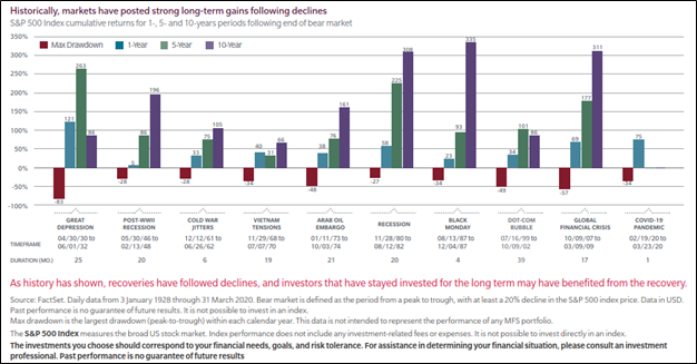 We went back and averaged them and found that average to be 50%. Even if you throw out the highest and lowest return years, it is still +46% on average one year after the end of a Bear Market.
The moral of the story is historically, you can recover most of a bear market’s ravaged returns in the 12 months after a Bear Market, assuming the average historical loss and that you are fully invested or adding back exposure at the market bottom. This historically has not been something individual investors have excelled. They instead buy at tops and sell at bottoms or stay out of the markets entirely, thereby, missing the recovery rally. Another obvious fact is that if you can minimize Bear Market losses, you can be back in the green even faster. That is the crux of our entire strategy for investors. We are not able to walk on water, but we have historically lost a lot less in Bear Markets while capturing most of the upside during Bull Market periods, delivering smoother returns over a full cycle and, in theory, higher overall returns. If we can help you garner a smoother ride while potentially earning higher returns over full market cycles, please reach out to us. We offer a free portfolio review. Disclosures: Past performance is not indicative of future returns or performance. Neither is past history necessary indicative of what could happen this time around. Every Bear Market period is different. The S&P 500 index used here is the S&P 500 Price Index. The S&P 500 Price Index is a market-capitalization-weighted index of 500 leading publicly traded companies in the U.S. It is not an exact list of the top 500 U.S. companies by market cap because there are other criteria that the index includes. This is index does not include reinvested dividends. The Bloomberg Aggregate Bond Index or "the Agg" is a broad-based fixed-income index used by bond traders and the managers of mutual funds and exchange-traded funds (ETFs) as a benchmark to measure their relative performance. The index includes government Treasury securities, corporate bonds, mortgage-backed securities (MBS), asset-backed securities (ABS), and munis to simulate the universe of bonds in the market. It tracks bonds that are of investment-grade quality or better. This has been a challenging year for investors. No one likes to see their portfolio decline even investors with really long horizons. It is this same distaste for losses that leads to excess fear during market declines and bad decision making, such as selling at the lows and then buying again into short-covering Bear Market bounces. The simple truth for all but the most nimble and skilled of investors is that a Bear Market is no fun! Yes, there are some managers who do well in a Bear Market, but they are a small number and typically are frequent traders or just happen to specialize in the one area the market that is outperforming, such as commodities and crude oil this cycle. What you don’t see is the years that that manager underperformed waiting patiently (or not so patiently) for their day in the sun. For most of us that are not traders, our goal in a Bear Market should be to lose as little as possible. This will then allow us to recover much faster when the smoke clears, the sun again rises and markets start to trend upward again, which they will. Let’s take a look at an example of why this is so important. Here are the assumptions in this example. First, our example portfolio is $200,000 in value at the end of last year. The year-to-date loss in the S&P 500 index is -13.44% on a price basis through May 27th and finally that the average S&P 500 Index Return over the last 50 years is +10% (per Investopedia). 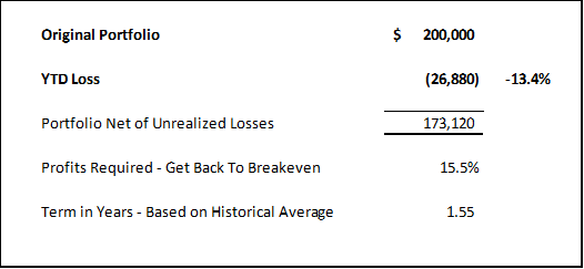 If we apply the year-to-date loss to the original portfolio value of $200,000 at year end, we have a portfolio value of $173,120 today. To get back to breakeven, the portfolio’s owner must earn +15.5% on the portfolio value today and in historical terms, it should take about 1.5 years to get back to breakeven. This is not so bad, but the loss was much worse just a few days ago and I would argue we are probably a long ways from the end of this Bear Market based on historical average returns and lengths in months. For comparison’s sake, let’s take the same assumptions accept the investor had all their money in the HFRX Global Equity Hedged Index (i.e., a representative of the overall hedge fund universe globally) and was down less at just -3.38% through May 27th. 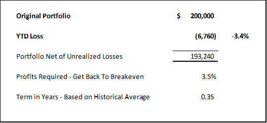 If we apply the year-to-date loss to the original portfolio value of $200,000 at year end, we have a portfolio value of $193,240 today. To get back to breakeven, the portfolio’s owner must earn just +3.5% on the portfolio value today and in historical terms, it should take about .35 years to get back to breakeven assuming they moved all their funds into the S&P 500 at the bottom of that decline. It would likely be a longer recovery period if the funds remained in the HFRX Global Equity Hedged Index based on historical returns, but not a lot longer. So, can you see the difference? The bigger the loss, the longer the recovery! .35 years vs. a recovery of 1.55 years. Which recovery would you rather have? I mentioned in the open that I thought this Bear Market has farther to run. So, let’s assume now the market drops -40% and all other variables are identical. 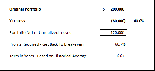 If we apply -40% loss to the original portfolio value of $200,000 at year end, we have a portfolio value of $120,000. To get back to breakeven, the portfolio’s owner must earn +66.7% on the portfolio value net of losses and in historical terms, it should take about 6.67 years to get back to breakeven. Ouch! Now let’s put this in perspective, 6.67 years is roughly 75% of the length of the average Bull Market. Who wants to wait that long to get back to breakeven? I would even make the case that the last 30 years of liquidity driven markets have distorted that average Bull Market length. A return to normal liquidity should result in shorter Bull Market cycles, but I digress. 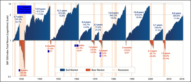 Now the really bad news! The average Bear Market has lasted about 1.4 years and resulted in a cumulative loss of -41% (per Cascade Financial Strategies).
We are now five months into this current Bear Market and, if history is any guide, we have at least eleven months to go and another -27.6% of possible downside. Not a pretty picture! What is the answer you say? The answer is to lose less. The answer is to utilize managers, such as InTrust Advisors, that raise cash, hedge or risk manage portfolios to minimize the damage from the Bear Market. As I mentioned early in this post, this is not easy, but I believe we have entered a cyclical period where just “buying and holding” will be dangerous to both your portfolio and financial plans! The easy money was made over the last 30-40 years, but with inflation spiking, debt at unsustainable levels, interest rates shifting into an upward trend and record valuations, it would stand to reason that eventually we need to sort all this out. The result is likely a period of greater volatility and lower returns for all investors, especially those (in my opinion) that just “buy and hold.” If we can help you lose less in this Bear Market and protect portfolio principal, while managing risk, please let us know. We offer a free portfolio review. We can also help you take a look at your financial plans and help get you back on track, assuming you are now off track. Do you have capital to put to work? There is no better way in an uncertain market than to use dollar cost averaging. What is dollar cost averaging you may ask? According to Investopedia, Dollar-cost averaging (DCA) is an investment strategy in which an investor divides up the total amount to be invested across periodic purchases of a target asset in an effort to reduce the impact of volatility on the overall purchase. The purchases occur regardless of the asset's price and at regular intervals. Here is a graphic example, courtesy of Binance: 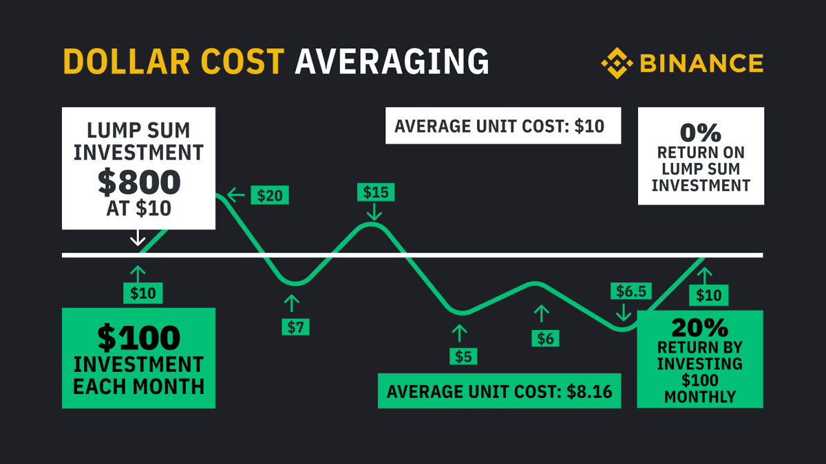 With dollar cost averaging in green, regular investments are made without regard to price at the time. Generally, as the example above shows, some purchases are at higher prices and some a lower prices in a volatile market.
The idea is to take the risk out of investing a single lump sum and being wrong on the timing, but instead letting time and the ability to purchase at differing price/cost levels be your diversifier. With single lump sums, if your timing is off, you can cost yourself money in a tough market, like the one we are in now as price moves below your entry price/cost. Dollar cost averaging helps you avoid this risk. Alternatively, in a fast-rising market, dollar cost averaging can cost you money as you buy at progressively higher levels vs. an early single lump sum. Although this is certainly a risk, the problem is that very few people have a crystal ball and get their market predictions correct even some of the time. As many of you may know, we are more active in how we manage portfolios and feel we have some insight into markets via our work. However, we rarely will be put a lump sum to work without averaging into positions over time because market forecasting is just so tough, especially in the short term. As an example, I have been expecting another bear market bounce as I am writing this post based both on market technicals and an overly negative investor sentiment, however, here we are a few trading days later with some indexes below their March low and others hanging on by a thread. Who could possibly forecast where markets go from here in the short-term, especially with Federal Reserve Meetings on the horizon? When is the best time to use Dollar Cost Averaging? The easy answer is any market, but we find it most helpful in volatile sideways or declining markets. Here is why. First, you are buying shares at lower and lower costs vs. a higher cost had you done a single lump sum. You are essentially averaging down, and history tells us there is a market bottom eventually. Second, a stock market downturn produces a kind of “clearance sale” environment. Envision the markets as a department store, with signs everywhere announcing 20% to 40% off. You have a chance to buy into some top-quality companies “on sale.” As a consequence of dollar cost averaging, you can now buy in at a lower price, obtaining more shares for your money. Finally, when the markets eventually turn up, these extra low-cost shares really supercharge the recovery of your overall portfolio vs. waiting to buy when it is clear that coast is clear. Dollar cost averaging is just one of the tools we use for clients in tough markets, like this one. We also employ hedging and tactical trading in some portfolios and the oldest strategy of them all in many portfolios, raising cash. If your advisor is not adding as much value as he seemed to be just last year, why don’t you reach out to us for a free portfolio review? I can tell you that our clients are not ringing the phone off our hook in this volatile Bear Market! In last month’s blog post entitled A Season of Volatility and Constant Change, I focused on the crazy world we now live and the possibility of us being in the Fourth Turning, a time of crisis where institutional life is destroyed and then rebuilt. We discussed that the economy runs in cycles and that was important as investors to understand those cycles. Investors must also be willing to look beyond what has worked in the recent past and instead understand what should work in the cycle to come. Finally, we outlined various asset classes and how they performed during different cycles and suggested that several asset classes that may not have recently performed well, but did so historically over much longer time periods, such as gold or commodities. Today, let's take a look some recent charts and see if we can spot any changes in our market environment that might cause us to pause and reexamine our current investment allocations. Let’s start with Commodities: What you can see is that commodities (below) have been in a downtrend since the middle of 2008 and only in 2021 did they break out of that downtrend. At present, commodities are over-bought and will likely pull back and retrace some of the recent move, but the trend has changed. In other words, we have probably started another long cycle where commodities do well (i.e., a commodity super cycle). 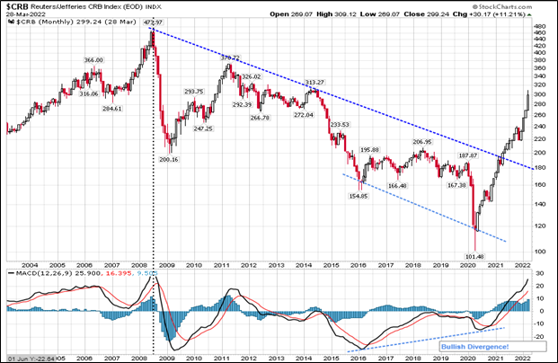 Here is something interesting, and I don’t have charts that go back further to test this over the past 100 years, however, look at when commodities last spiked and what happened to the S&P 500 index (pink line – below chart and red box). It went into a Bear Market decline. 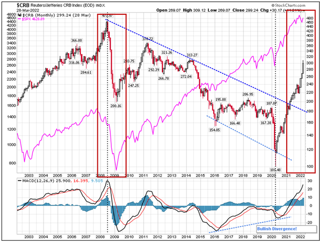 Our spike in commodity prices is even more extreme in 2021-2022 and the S&P 500 also could be just starting another decline. It is definitely worth watching this! Next up let’s look at interest rates, which move inversely with bond prices: Here is a chart of the ten-year treasury yield or interest rate, below. Notice that we have been in a declining rate environment since 1981 and only recently have we peaked above that long-term down trend in rates. This means that bonds have benefited from 40 years of declining rates, which have inversely pushed bond prices higher. We have yet to take out the prior lower highs at 3.25%, but I would guess that is where we are headed in the longer term. We may get another pull-back in rates as commodity related inflation recedes in the short-term, but higher rates appear to be in the cards eventually. 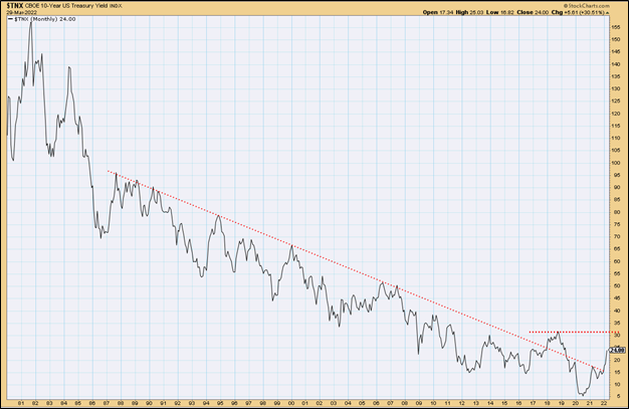 Next let’s look at Gold 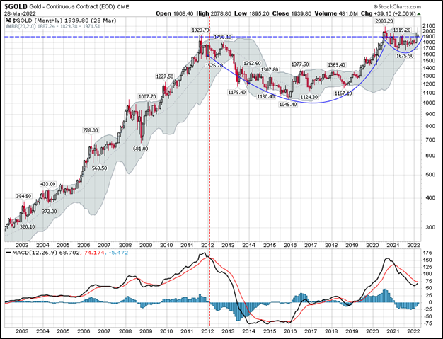 As you can see above, gold rose through 2011 and then have been forming a cup from 2012 through 2020. Recently it has been forming a handle on the cup. This is a very powerful chart pattern and could portend that gold is about to go much higher in price. How many of you hold gold in your portfolios? I would guess that basing pattern since 2011 has pretty much soured all but the hard-core gold bugs on holding the yellow metal! That is how markets seem to work. When everyone is shaken out, then that asset price moves up and we are left to chase it higher. That is a very good-looking chart! So much so, I bought more gold today. Finally, let’s look at volatility. This is interesting! 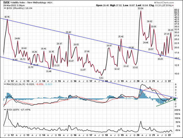 Volatility or the VIX is in the is a measure of the price movement in equities (in this case).
This chart is a bit busy, and I apologize, but the top pane of the chart shows the VIX or Volatility index. We have traded in a downward channel of lower volatility since Great Financial Crash of 2007-2008. However, since 2020 that volatility has spiked to a new level and held that level above 15. Also look at the MACD histogram in Blue in the middle chart pane, it is about to cross up through the zero line, which likely means higher volatility is in our future. Finally, the bottom pane is the correlation between equities and volatility. You will note that they are negative and inverse most of the time. This means that as volatility spikes, equities decline. Why do I show you all this? Certainly not to ruin your day! However, I do want to shake you to act! I firmly believe “we are not in Kansas anymore” in the words of Dorothy from the Wizard of Oz. You and your advisor cannot just do business as usual with your 60% equity and 40% bond portfolio. This next decade I do believe is going to challenge most investors. It is important that you be in the right asset classes and have the right approach to markets. I believe this unfortunately is a period where “actively traded”, beats “buy and hold.” It’s more work, it’s not as tax advantaged and it's more expensive, but it may be necessary to achieve your long-term objectives. This is what we do well. Let us know if we can help. |